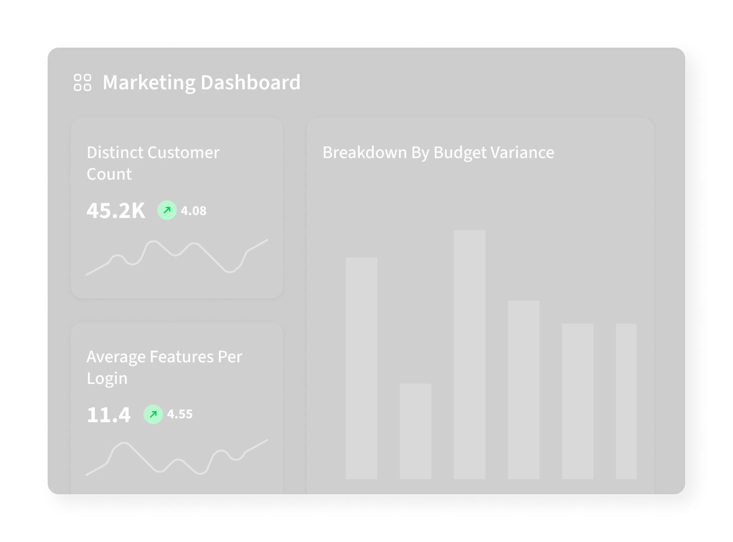
Intelligent charts auto-select the right visualizations for discovered signals so teams see the clearest picture without manual edits.
What intelligent charts do
Rather than forcing users to select chart types and axes, Othor suggests the best visualization for a signal automatically. The home page features this capability as part of our "Intelligent charts" messaging.
How it chooses a visualization
The rules are simple and practical:
- Time series with a single metric → line chart with confidence bands.
- Categorical breakdowns with many categories → bar chart showing top categories and an "others" grouping.
- Correlations between two numeric metrics → scatter with regression line.
Real example
When a signal surfaces low conversion, the intelligent chart shows cohort trends and overlays promotional periods and price changes. The visual is tuned to the user's role — product managers see a different default view than analysts.
Developer note (test)
This post ensures chart images, figure captions, and the overall long-form rendering work correctly in our MDX pipeline.